
UI/UX
Digital Phone App
OFFTHERACK - UI/UX Case Study
In my UI/UX class, an assignment was given to design an app regarding any topic I was interested in. With this free range of creativity, I gained the opportunity to create an app following fashion, scheduling outfits, as well as purchasing clothing from small businesses online with a shopping feature.


The Problem
Over the years I have noticed that as online media progressed, so did online shopping. While online, users would always look into buying clothing, When doing so, there would be no definitive way into knowing how an article of clothing would fit or look unless they come inside the store and try the item on in a fitting room. Other than this, some people face the problem of being unable to visit a store due to location, physical inability to go to the store, or lack of transportation.


Another issue facing clothing is that users oftentimes can get busy or overwhelmed in planning an outfit, often missing events or being late to these events as they are unsure of what to wear. I decided this could be resolved if users can keep track of their clothing and plan their outfits ahead of time.
The Vision
To combat these issues, I designed an app for an online virtual closet space. The aim was for users to try on clothing from stores, and clothing users currently own. This allowed a boost of assurance in sizing and style of clothing, sales for businesses, help organize closet space, and encourage time management in users.

Getting Started
As a class project, I took on the lead role of the UX/UI designer of doing competitive research, data analysis, designing the layout of the project, as well as being a photographer for all the images used within this project.
Early Sketches of Logo


This project took about a month to complete, starting with choosing a topic, doing research on competitors, brainstorming for designs, creating wireframes, having photoshoots, designing content such as buttons and layout, and ending with a mockup of the design using Adobe XD.
Crazy 8 Sketches of Layout


With all this information in mind, I began this project starting off with using different problem solving processes such as crazy 8’s, moodboards, empathy map, and more.
Moodboard

This project required digital and physical sketching, tools for designing the work and wireframe such as Adobe Illustrator and Adobe XD, as well as using photography equipment such as a Canon T7i camera, paired with two small strobe lights and the utilization of Adobe lightroom for editing.
Empathy Map


Empathy maps were used to understand the target audience better. My initial plans were to have the app be used by those who want to buy clothing and use the closet space. I also planned to have a version for those who want to sell their clothing. Left empathy map is for buyers, and the right is for sellers
Competitive Analysis
When doing competitive analysis, I looked into multiple clothing brands to find data for the sellers version of the app, as well as for those who wish to only use the closet space or try online clothing.
MANGO
POSHMARK
ANTHROPOLOGIE
OFFER UP
H&M
UNIQLO
MERCARI
ZARA
DEPOP
SELLERS
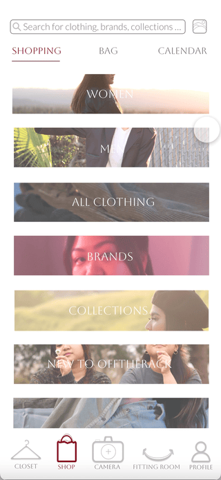
I researched several different popular clothing apps aimed to find elements I wanted to include in the shopping area and sellers version
Some of the aspects that I wanted to look for in particular within these apps were the following:
PAGES
HEADER DESIGN
ADS
ICONS
MENU
CAMERA
LAYOUT
SUGGESTIONS
CATEGORIES
SECTIONS ON HOMEPAGE
DESIGN
NO HAMBURGER MENU
PHOTOS AS
BUTTONS
NAVIGATION
INFORMATION PANEL MENU
ADVERTISEMENT PHOTOS FOR SUBRBANDS
DESIGN
Some of the aspects that I wanted to include based on the research:
FOR BUYERS OR THOSE WHO WANT TO USE CLOSETSPACE
BUYERS
I researched a few closet apps that have the same concepts
WHERRING
XZ
PUREPLE
MY WARDROBE
CLOTHING STATS
OUTFIT SUGGESTIONS
EXTRA FEATURES
CAMERA
CALENDAR
CLOSET LAYOUT
HOMEPAGE
SHORTCUTS AND ICON
DESIGN
Some of the aspects that I was looking for when researching
WORKSPACE TO MATCH CLOTHING TOGETHER
IMAGE SEARCH
LAYOUT OF CLOSET SPACE DISPLEASING
Some of the aspects that I wanted to include and stray away from based on the research:
DESIGN
ICON DESIGN
COLORS
NAVIGATION
GESTURES
HELP
HEADER
SETTINGS
CATEGORIES
ACCESSIBILITY
EXTRA FEATURES
For all apps I wanted to look into these aspects for inspiration
DESIGN
Final Touches - Layout Changes
Upon creating the app, I had received feedback from a set group of 25 people. I had realized that the layout needed a lot of work in terms of composition and placement of graphics. My initial thoughts were using borders, but after discussion, major changes to the layout were made.
Key Changes
When viewing an item, the pages and search bar at the top were removed and the images were blown up to fill the artboard, or iphone border.


Layout changes
The border was taken away from the layout, and adjustments to the grids were made. Organizing the categories were also adjusted.
After making some layout changes, I also made changes with small, yet noteable aspects of the design such as the pop up menus were an important aspect I contemplated on for awhile. I decided to get more opinions on these changes.
Trial and Error
After creating a mockup of the app on Adobe XD, I asked a group of 15 people, ages 18-28 to test the app and get their opinions on certain aspects such as the pop menus, location of icons, and layout of the app.
Menu
Version A had a slidebar menu, pulling from right to left. The vision was to mimic the motion that users use when scrolling between pictures while online shopping.
Version B had a popup menu that comes from tapping on the icon, and pops upwards.
Discovery
Users preferred Version B, the menu as a pop up after selecting the icon.


Orientation
From the first discovery, I wanted to rid of the slidebar menu and test out icons.
Version A had the icons on the side, opening up from right to left.
Version B had the icons below the image, opening upwards.
Another Discovery
I found out that users preferred the icons at the bottom and the menu opens up vertically, rather than horizontally.
Keypoints
I found that users preferred notifications to view what the next step is, such as when selecting the fitting room icon, the app is letting the user know that the user is being sent to the fitting room area.
Notifications

App has notifications near the menu bar that shows the user what the icons are doing or what the next action is
Clear for all users to use

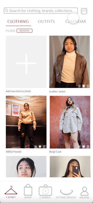
Image Search
Users can easily finds items similar to the ones they own
Camera Feature
AI Camera Feature that scans your clothing out of the background, once images or videos are taken. Can easily select clothing item you want to upload to closet once scanned and detected. Allows you to freely upload on the go, all you need to do is stand with a clear background and snap the pictures

Final Endpoint
This project displays the careful display of designing convenience to users, using an interface that has never been used before, such as the 360 degree view space paired up with a closet space.
This project helped a lot with understanding users on what is more convenient, accessible while also being pleasing to the users all at once. After finishing this project, this felt like a turning point for my experience as a designer, learning more about UI/UX design and being able to bring my passion of fashion, photography, and design into one element.